Table of Contents >> Show >> Hide
- Start With the Room You Have (Not the Paint Chip You Wish You Had)
- How to Choose Bedroom Colors That Still Look Good at 10 p.m.
- Color Pairing Basics (No Art Degree Required)
- 10 Bedroom Color Schemes That Rarely Miss
- 1) Warm White + Natural Wood + Black Accents
- 2) Creamy Greige + Soft White Trim + Linen Neutrals
- 3) Misty Blue + Warm Tan + Crisp White
- 4) Soft Sage Green + Ivory + Aged Brass
- 5) Navy + Taupe + Gold
- 6) Clay/Terracotta + Cream + Walnut
- 7) Deep Forest Green + Warm White + Cognac Accents
- 8) Dusty Blush + Charcoal + Soft White
- 9) Muted Lilac + Warm Gray + Light Oak
- 10) One-Color "Drench" + Tonal Textiles
- Details That Make a Bedroom Palette Feel Expensive (Even if Your Budget Is Not)
- Common Bedroom Color Mistakes (and Easy Fixes)
- Wrap-Up
- Experience Notes: of Real-World Bedroom Color Lessons
Choosing a bedroom color scheme sounds like a fun weekend project until you remember you’ll be waking up to that color every day. Pick well and your room feels like a soft landing. Pick poorly and you’ll start side-eyeing your walls like they personally offended you.
The good news: getting bedroom colors right isn’t about memorizing the “correct” shade of beige. It’s about pairing the right mood with the right light, then supporting it with textures and accents so the room feels intentional–not accidental.
Start With the Room You Have (Not the Paint Chip You Wish You Had)
Before you fall in love with a color name like “Quiet Whisper” or “Cloudy Daydream,” do a quick reality check. Bedrooms are sensitive to lighting shifts, and paint changes character dramatically from morning to evening.
1) Read your natural light
- North-facing rooms often feel cooler and a bit gray. Warm undertones (creamy whites, warm greiges, soft clays) tend to look more inviting.
- South-facing rooms get steady, warm light, so colors usually look richer. You can go deeper without the room feeling gloomy.
- East-facing rooms get bright morning light and calmer afternoons–great for gentle blues and greens.
- West-facing rooms can go golden late-day; warm colors may look extra warm unless balanced with cooler accents.
2) Match undertones to the things you’re not changing
Floors, large rugs, and big furniture pieces “vote” on how your walls will look. If your wood floor leans orange, some cool grays can read bluish. If your carpet is cool beige, overly creamy whites can turn yellow. Aim to echo undertones (warm-with-warm, cool-with-cool) so everything feels cohesive.
3) Build a palette, not a single color
Walls are the backdrop, not the whole movie. A calm bedroom usually needs:
- One main wall color (the mood)
- A supporting neutral (trim, ceiling, large furniture)
- One or two accents (art, pillows, lamps, a throw)
If you like simple structure, try the 60-30-10 guideline (dominant/secondary/accent). It’s not a rule–more like a guardrail that keeps your room from looking like a paint store exploded.
How to Choose Bedroom Colors That Still Look Good at 10 p.m.
Decide the vibe first
- Calm + airy: warm whites, light greiges, misty blue-grays, pale greens.
- Cozy + cocooned: navy, charcoal, deep green, chocolate brown (balanced with lighter bedding).
- Warm + cheerful: clay/terracotta, muted blush, buttery yellow, creamy neutrals.
- Modern + crisp: clean neutrals with graphic contrast, or a single saturated hue with minimal clutter.
Sample like you mean it
Small swatches are paint’s equivalent of a flattering profile pic. Test a larger sample on multiple walls and view it in morning, afternoon, and nighttime lighting. If it survives your worst lamp situation, it’s a keeper.
Pick a finish that flatters bedrooms
Matte or eggshell is usually the sweet spot: soft-looking, low glare, and still cleanable. Bedrooms don’t need shiny walls unless you’re going for “dance club chic,” and even then… maybe keep that to the basement.
Color Pairing Basics (No Art Degree Required)
If “undertone” makes sense but “palette” still feels mysterious, borrow a little color theory. It’s basically a fancy way of saying: choose relationships that look calm, not chaotic.
- Analogous schemes (neighbors on the color wheel) feel naturally restful: blue + blue-green + green, or peach + terracotta + warm brown. Great for bedrooms because the eye flows instead of bouncing.
- Complementary schemes (opposites) create energy: blue + orange, purple + yellow. In bedrooms, keep one side muted and use the other as a small accent–otherwise your room may feel like it’s ready for a pep rally.
- Monochrome schemes (one color in multiple depths) feel designer-y fast: think pale sage walls, medium olive bedding, and a deep green throw.
When in doubt, keep walls and big textiles in the softer half of your palette, then let smaller pieces (art, pillows, lampshades) carry the “pop.”
10 Bedroom Color Schemes That Rarely Miss
These palettes show up across designer roundups because they’re flexible and sleep-friendly. Treat them like recipes: swap materials and accents to match your style.
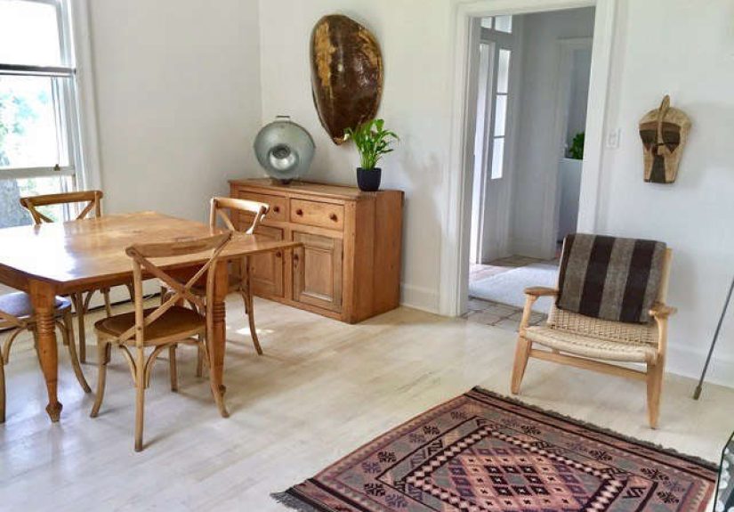
1) Warm White + Natural Wood + Black Accents
Why it works: Bright without feeling clinical. Wood adds warmth; black adds definition.
Try it with: oak or walnut nightstands, black-framed art, ivory bedding, and a textured rug.
2) Creamy Greige + Soft White Trim + Linen Neutrals
Why it works: Greige (the friendly gray-beige handshake) reads modern but cozy and plays well with almost any decor.
Try it with: oatmeal curtains, warm metal accents, and layered whites (mix multiple whites–don’t use one “printer paper” white everywhere).
3) Misty Blue + Warm Tan + Crisp White
Why it works: Blue feels soothing; tan prevents it from feeling icy; white keeps it fresh.
Try it with: a white duvet, tan leather details, and natural fibers like jute or woven shades.
4) Soft Sage Green + Ivory + Aged Brass
Why it works: Muted greens feel restorative, especially paired with creamy neutrals and warm metals.
Try it with: ivory bedding, warm wood tones, and a charcoal throw for depth.
5) Navy + Taupe + Gold
Why it works: Navy adds tailored drama; taupe softens contrast; gold/brass reads intentional.
Try it with: cream bedding, a taupe upholstered headboard, and warm metal lamps.
6) Clay/Terracotta + Cream + Walnut
Why it works: Earthy reds and clays feel grounded and cozy, especially in cooler light.
Try it with: cream bedding, woven textures, and art that repeats both warm and neutral tones.
7) Deep Forest Green + Warm White + Cognac Accents
Why it works: Dark green is cocooning without the “black hole” effect. Warm whites and cognac keep it rich and welcoming.
Try it with: warm white sheets, wood furniture, and layered lighting (two bedside lamps minimum).
8) Dusty Blush + Charcoal + Soft White
Why it works: Blush looks modern when it’s muted and grounded with charcoal. Cozy, not cutesy.
Try it with: charcoal accents, natural wood, and lots of texture (knit throws, velvet pillows).
9) Muted Lilac + Warm Gray + Light Oak
Why it works: A toned-down lilac can feel like twilight–quiet, soft, and unexpectedly sophisticated.
Try it with: simple white bedding, pale gray curtains, and a deeper plum accent in art.
10) One-Color “Drench” + Tonal Textiles
Why it works: Using one shade across walls (and sometimes trim) creates an immersive, high-design calm. Fewer visual “stops” can feel more restful.
Try it with: a medium-to-deep blue-green, brown, or smoky plum, then layer bedding in related tones and let texture do the heavy lifting.
Details That Make a Bedroom Palette Feel Expensive (Even if Your Budget Is Not)
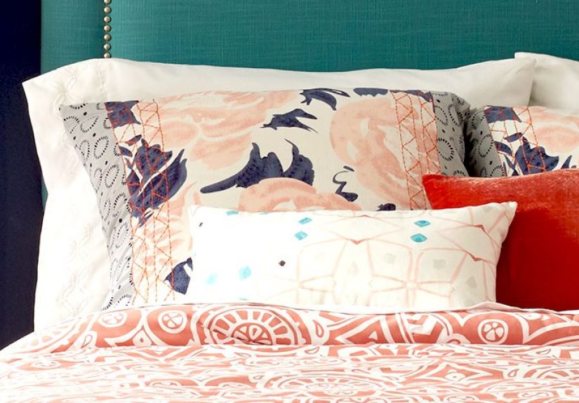
Use bedding as your palette anchor
If you already love your duvet, start there. Pull 2-3 colors from it and build around those. Bedding is a massive surface area–and far easier to swap than repainting because you found a new favorite throw pillow.
Make peace with the ceiling
Bright white ceilings can look crisp, but they can also create a harsh stripe against warmer walls. A softer white (or a ceiling tinted toward the wall color) often makes the room feel calmer. In small bedrooms, painting the ceiling the same color as the walls can even make the space feel larger by blurring boundaries.
Let lighting “edit” your colors
Warm bulbs tend to flatter bedrooms and make colors feel cozier. Cooler bulbs can make grays and blues look sharper, sometimes even dull. For comfort, use multiple light sources (bedside lamps + a floor lamp) instead of one overhead spotlight that makes you feel like you’re being questioned by a detective.
Common Bedroom Color Mistakes (and Easy Fixes)
- Mistake: Copying a photo without considering your light.
Fix: Use photos for inspiration, then sample in your own room. - Mistake: Going too bright and saturated on the walls.
Fix: Choose a muted version, or keep bold color in textiles and art. - Mistake: Using cool gray everywhere and wondering why the room feels chilly.
Fix: Warm up with creamy whites, warm woods, and layered warm lighting–or pivot to a warmer greige. - Mistake: An accent wall that feels random.
Fix: Put it behind the bed and repeat that color in 2-3 smaller items so it looks planned.
Wrap-Up
The best bedroom color scheme is the one that looks good in your light, supports rest, and feels like you. Start with a mood, test generously, keep the walls calmer than the accents, and use texture to add richness. When you do, your bedroom stops feeling like “a room with a bed” and starts feeling like a place you actually want to end (and begin) your day.
Experience Notes: of Real-World Bedroom Color Lessons
Design advice is helpful, but living with a color is the real test. Over and over, the same experience-based lessons show up in homeowner stories and designer interviews–especially when it comes to bedrooms, where you see paint under warm lamps, dim evenings, and half-awake mornings.
First: the “daylight decision” is a trap. A color can look gorgeous at noon and completely different at 9 p.m. That’s not the paint being sneaky; it’s your lighting changing the entire mood. People who love their final choice almost always check samples in the morning, late afternoon, and at night with the lamps they actually use. If you’re replacing bulbs, do it before you commit–otherwise you’re changing the filter on the whole room after the fact.
Second: muted usually wins long-term. Bright, saturated colors photograph beautifully, but many people find they feel overstimulating when they’re trying to wind down. The happiest outcomes often come from “soft versions” of popular hues: dusty blue instead of neon sky, sage instead of emerald, clay instead of brick red, smoky plum instead of purple grape candy. You still get personality–just not a wall that shouts when you want it to whisper.
Third: neutrals are only “safe” when their undertones behave. A white that looks clean in a store can look yellow next to cool bedding. A gray that seems modern can turn icy in low light. Real-life wins happen when people compare samples against trim, floors, and bedding at the same time. Neutrals don’t exist alone; they’re constantly reacting to their neighbors.
Fourth: bedding can either save you or sabotage you. If your walls are calm but your duvet is high-contrast (sharp black-and-white graphics, for example), the room can still feel visually loud. Many people report that swapping to softer patterns and lower-contrast textiles makes the bedroom feel calmer instantly–sometimes more than repainting. If you’re unsure, adjust textiles first, then paint.
Fifth: “cozy dark” works best with a brightness plan. Navy, charcoal, deep green, and brown bedrooms can be stunning and cocoon-like, but they need help: lighter bedding to reflect light, at least two lamps, and warm materials like wood, brass, or woven textures. Without that support, dark paint can feel flat instead of plush.
Sixth: the “one accent wall” idea only works when the color is repeated elsewhere. A dramatic wall behind the bed can look amazing–unless nothing else in the room connects to it. The fix is simple: repeat the accent color at least three times (a pillow, a piece of art, a throw, a lampshade). That repetition is what turns “I painted a wall” into “I designed a room.”
Finally: trend awareness is useful; trend obedience is optional. Design trends change faster than your patience for repainting. A practical approach many people love is to choose a wall color that feels good in their light, then “trend” with swap-friendly accents: pillows, throws, art, and rugs. That way your bedroom can evolve without you repainting every time the internet discovers a new shade of green.